Kinetic typography, timed to the beat
A 14-second vertical intro where every word moves on the music. It’s also the quickest way to see what I do.
Player: my own Blueprint skin for Video.js.
01 · The idea
Three words, two promises, one name
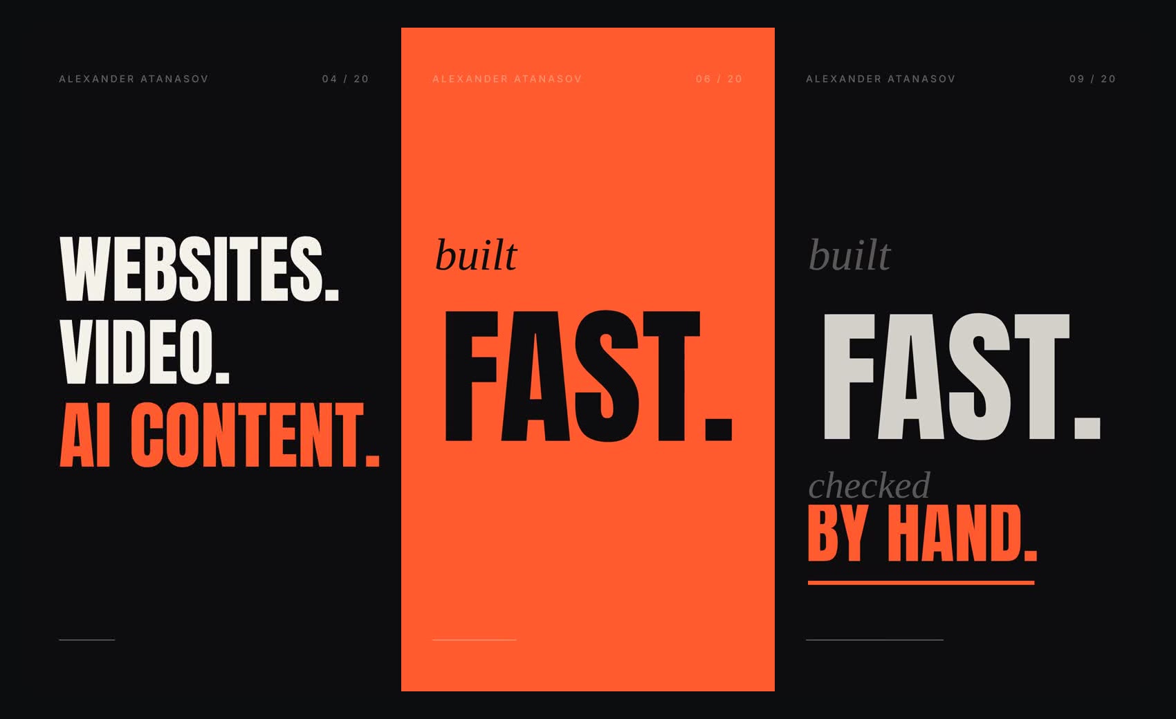
The script is as short as the video: “Websites. Video. AI content.” Then “built fast, checked by hand.” Then my name. Each line gets its own moment on the beat, so it reads like the music is saying it.
02 · The motion
A small set of moves, used with rhythm
- Masked reveals: each line slides up from behind an invisible edge, so the text appears to rise out of the frame.
- Contrast in type: a tall condensed sans for the loud words and an italic serif for the quiet ones (“built”, “checked”).
- One colour hit: the only full-screen colour is on “FAST.”, and it lasts exactly one beat.
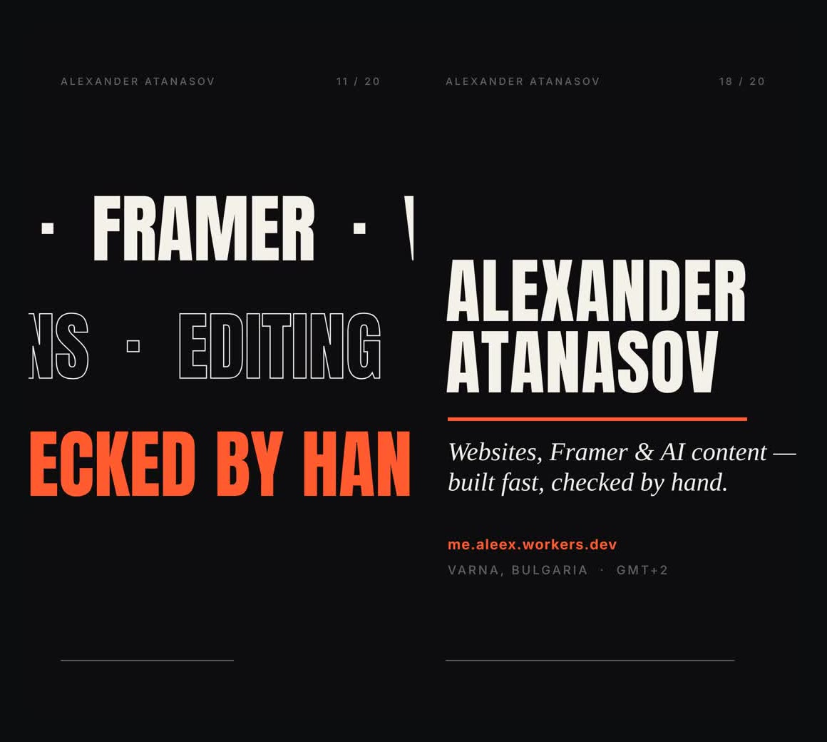
- Scrolling rows: three rows of services move in opposite directions, with solid, outlined and accent text for depth.
- Letter-by-letter title: the name builds up one letter after another, then the tagline and link fade in.
03 · How it’s made
Animated in code, cut to the music
Every frame is drawn in code on a 1080×1920 canvas, so the timing is exact: I detected the beats in the track and tied each animation to a beat number rather than to a guess. Changing a word, a colour or the music means re-rendering, not re-animating by hand.
04 · Takeaway
Restraint reads better
A few moves, repeated with rhythm, read better than many effects. The colour flash only works because it happens once.